Grid vs Forum View: Which Do You Prefer?

[$provider]
    • Moderators
    • Gold Top Dog

    Grid vs Forum View: Which Do You Prefer?

    At DOG.community, we always try to provide the best possible experience for everyone. However, this does not guarantee that we will avoid all missteps along the way.  And this is where our loyal users can continue to help us!  We’d like to improve the community experience with your help by defining which community view you prefer. We currently have two different views to the community: the grid and the forum. Which view is your favorite and why? We outlined both views for you to help you decide!

    The Forum:
    This view is a traditional forum layout, with every active subject displayed from oldest to most recent. Here users can find conversations that are relevant to them based on their interest.


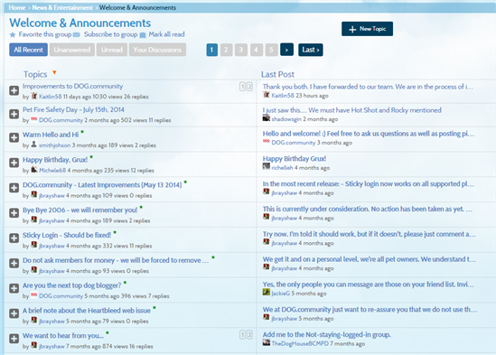
    On the left side: Each ‘Topic’ is listed within each respective category. The most recent topic is displayed at the top of each category.

    On the right side: Users can see the latest post for each topic, along with who responded and the date/time of the most recent post.

    Pros:  

    -          This view is similar to a traditional forum view

    -          It is familiar to some users

    -          Each category is broken down by conversation

    -          The latest reply is displayed on the right of the conversation

    Cons:

    -          Requires an extra click to get to content and respond

    -          Easier to miss new content

    The Grid:
    The second and less traditional view that lives on our community is the Grid. Displayed on the homepage as users enter the community, this view is most closely associated with a “timeline” that can be seen on other social media outlets.

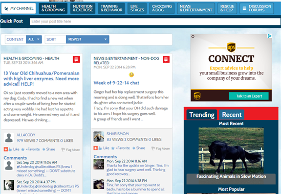
     With this view users can:

    -          see the most recent posts

    -          respond without clicking on post

    -          utilize quick post to start a new topic


    Pros:

    -          This view is similar to a timeline making it easy to navigate for some users

    -          There is no need to go to the forum view or custom text editor to respond to post

    -          Users can stay up-to-date on latest news and conversation without searching

    Cons:

    -          Specific posts get buried quickly

    -          It can be hard to find a post

    -          On the main grid, posts are not broken up by category


    Community, now is the time for you to give your input. Which view do you prefer? What is your reasoning? We want to hear from you so start talking! 

    • Gold Top Dog

    I personally like the traditional format because I can pick the category I want to read. I don't like the grid format at all. It's too hard to find posts and all the pictures make it appear cluttered. I'm not on other social media and if they all look like this grid, I'd hate it.

    • Gold Top Dog

    I've gotten used to the Grid display but I can't say I prefer it. Too busy and cluttered with videos I'm not interested in seeing. I can see thousands and thousands of cute dog, cat, horse, frog, you name it, videos on FB, if that's what I was looking for.  The traditional forum format is preferable to me but I can navigate either one. Not necessarily that easy to find threads in either format but especially in the grid format.  

    • Gold Top Dog

     I agree with Jackie and Tina and prefer the traditional format.

    • Gold Top Dog

    @sharismom
    I personally like the traditional format because I can pick the category I want to read. I don't like the grid format at all. It's too hard to find posts and all the pictures make it appear cluttered. I'm not on other social media and if they all look like this grid, I'd hate it.

    Agreed, 110%  I do not use Facebook, so the timeline look is chaotic to me.  Frankly, I don't like that type of look on ANY website, including my local newspaper!  I always look for an option to click for a traditional list-type format if possible.

     I don't use this site to just see cute photos or funny videos.  I want to engage in a more conversational manner --  sharing info, in a mutual exchange with the other members.  I can go elsewhere if I just want to click on some videos or pics, in a solitary activity.  Of course, I love pics/videos from active members who illustrate threads -- that's different than the random clicking on a single photo or video that isn't part of an exchange.

     Also agree that the traditional format now is a bit clunky compared to the "old" traditional format, but it's better than the Grid.  

    • Moderators
    • Gold Top Dog

    Definitely the traditional layout.

    It is supposed to be a forum (in my mind) not a social media site where I don't get to choose my 'friends' or what is on my 'feed'.

    I can see much more content with the traditional view in a single glance which makes it easier and quicker to see which threads I want to read or be part of

    • Gold Top Dog

    Neither?

    I liked the way the Discussion Forums tab was a month or so ago.  It was still a list format, but as threads were posted/commented on they moved to the top.  It made it really easy to see which discussions were active (regardless of sub forum) and what had popped up recently that I hadn't seen or may want to read.

    I guess the "grid view" is the closest to that, so I suppose that is what I'd prefer if we only have the 2 current options to pick from.  I don't really like the look of the grid view, since it does seem cluttered.  Compared to the current layout of the Discussion Forums tab it is easier (for me) to find the currently active threads.

    • Gold Top Dog

    ^^^what Steph said.

    • Gold Top Dog

    @TheDogHouseBCMPD
    I liked the way the Discussion Forums tab was a month or so ago. It was still a list format, but as threads were posted/commented on they moved to the top. It made it really easy to see which discussions were active (regardless of sub forum) and what had popped up recently that I hadn't seen or may want to read.

    Agreed 110%.  I would've suggested this as my preferred choice of layout, but I assumed we only had the choice between the 2 newest options.  I see Steph's point about the Grid format being more similar to that third preferred option.  If we have to stick with that, maybe there could be a way to click on something to sort all those grid panes so the ones with the most recent reply post come to the top?  A better way to filter them so it's not so cluttered would be helpful.